Chapter 5 Results
5.1 Covid-19 in the United States
In order to compare the mobility of people against the transmission of Covid-19 we must first investigate how the virus spread throughout the United States.
Main approach we had taken for this project was exploring Covid data at macro level first, then subsequently moving into micro perspective. Can we find any insight from the state level, big picture data?
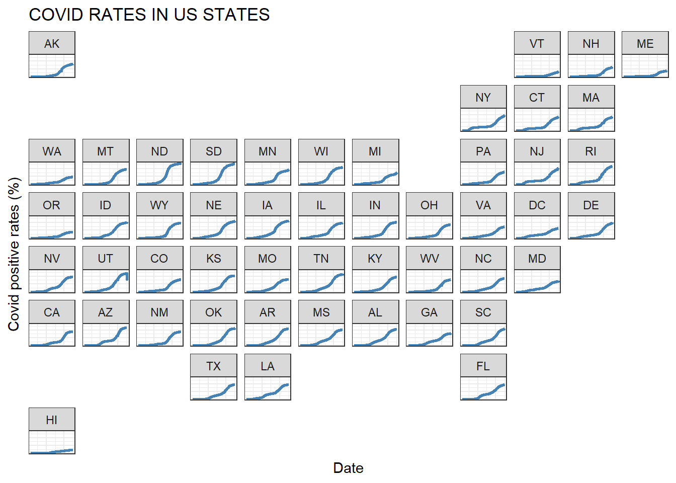
R package, ‘geofacet’, doing a great job here to display time-series of each state visualized on a US map. This plot tells us the overall Covid trend across the states. No surprise here to find that Covid rates accelerated around the last summer, then slowed down in most states. We also observe that some northern states (e.g Vermont) and geographically isolated regions (e.g. Hawaii) have Covid rates plateaued at relatively low levels. But every state is different in size, we need more analysis to see any relations with population size, mobility, traffic and so on. Let’s move to the next plot.
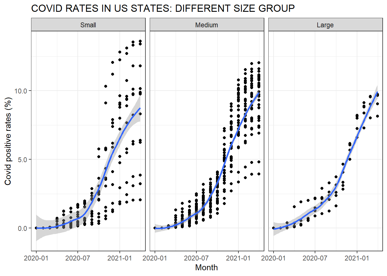
Naturally, we get curious to find out whether Covid trends differ across different population size in each state. We divided all US counties and states into three sub-categories (‘large’, ‘medium’, ‘small’), and plotted three separate facet grids for each size configuration.
For this graph, ‘geom_point()’ was used to display multiple time-series in one graph. We can clearly see that ‘small’ population states show wider variance of Covid rates, especially going through multiple waves of Covid spread in the latter part of the year. And interestingly enough, most states with higher than 10% Covid rates belong to this ‘small’ category.
Can we hypothesize that a smaller population leads to higher Covid rates? Does this scatter plot have enough telling? Not so fast ! Soon after we visualized the average trendline using ‘geom_smooth()’ function, we had come to find that overall Covid trend remain similar to each other across three different size categories afterall.
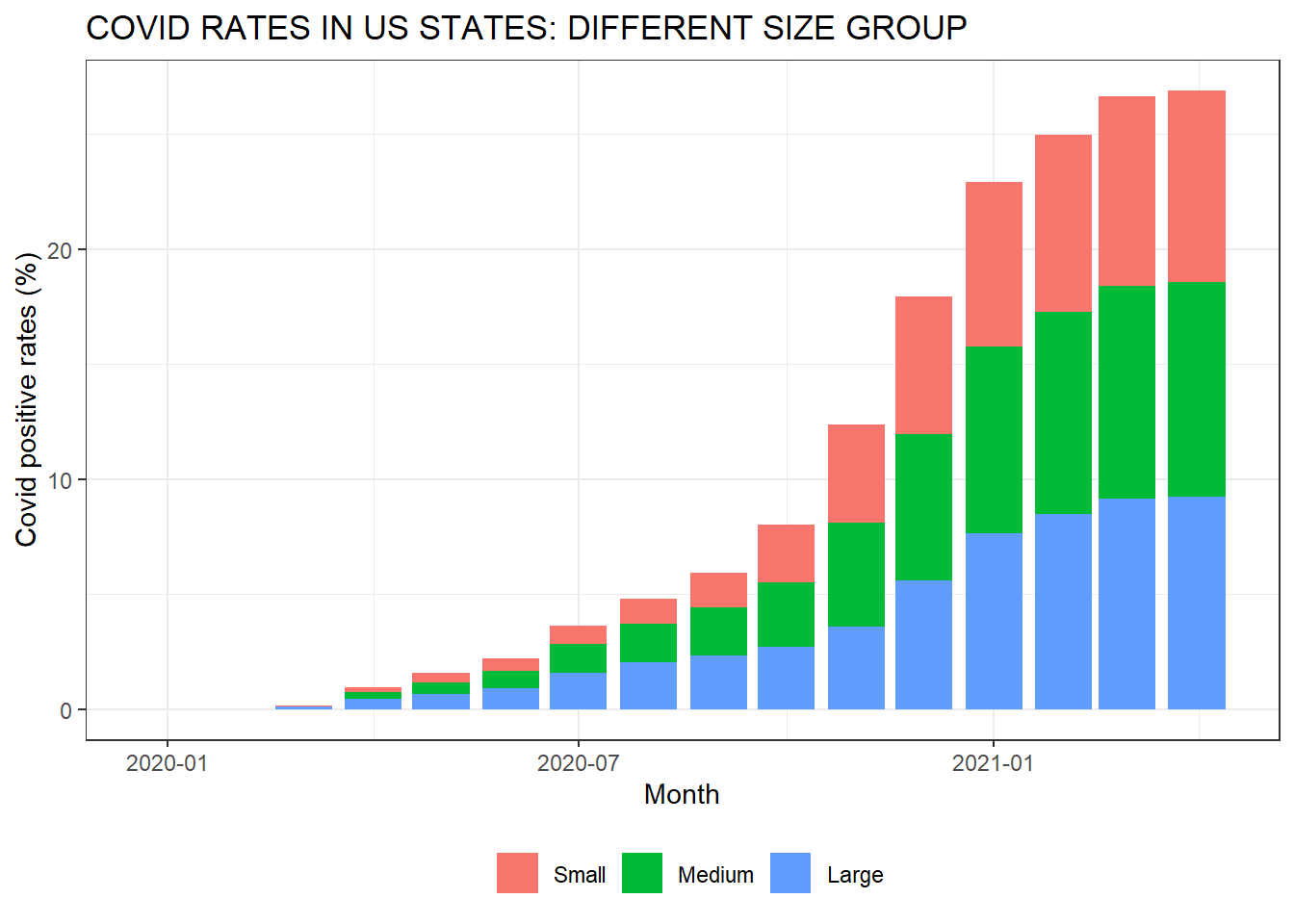
Covid rates plateaued around 10% across the states, can we observe the same pattern during the early spike in Covid cases in the US? Let’s have a closer look at Covid trend since the first outbreak in March 2020. For this, we chose a stacked bar chart to compare case numbers across categorical variables (population size).
Do you also see the large states dominated the early Covid spikes, say for the first 100 days or so? Perhaps, is this telling that there might be some connection between Covid outbreak and flight traffic in-and-out of the major airport hubs? Or, is this due to the density of the region and mobility of people residing there? We will explore this further using other dataset as we progress our project further joining additional data.
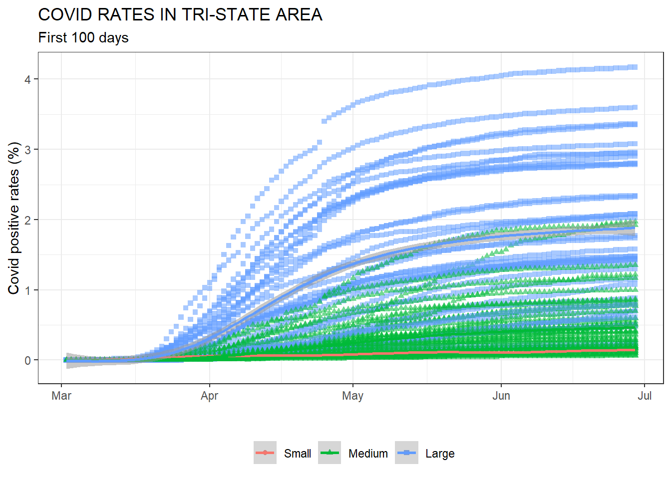
In the meantime, as many of us are living near New York City, we thought it is a good practice to carefully check what happened in the Tri-State area and its major counties in early 2020.
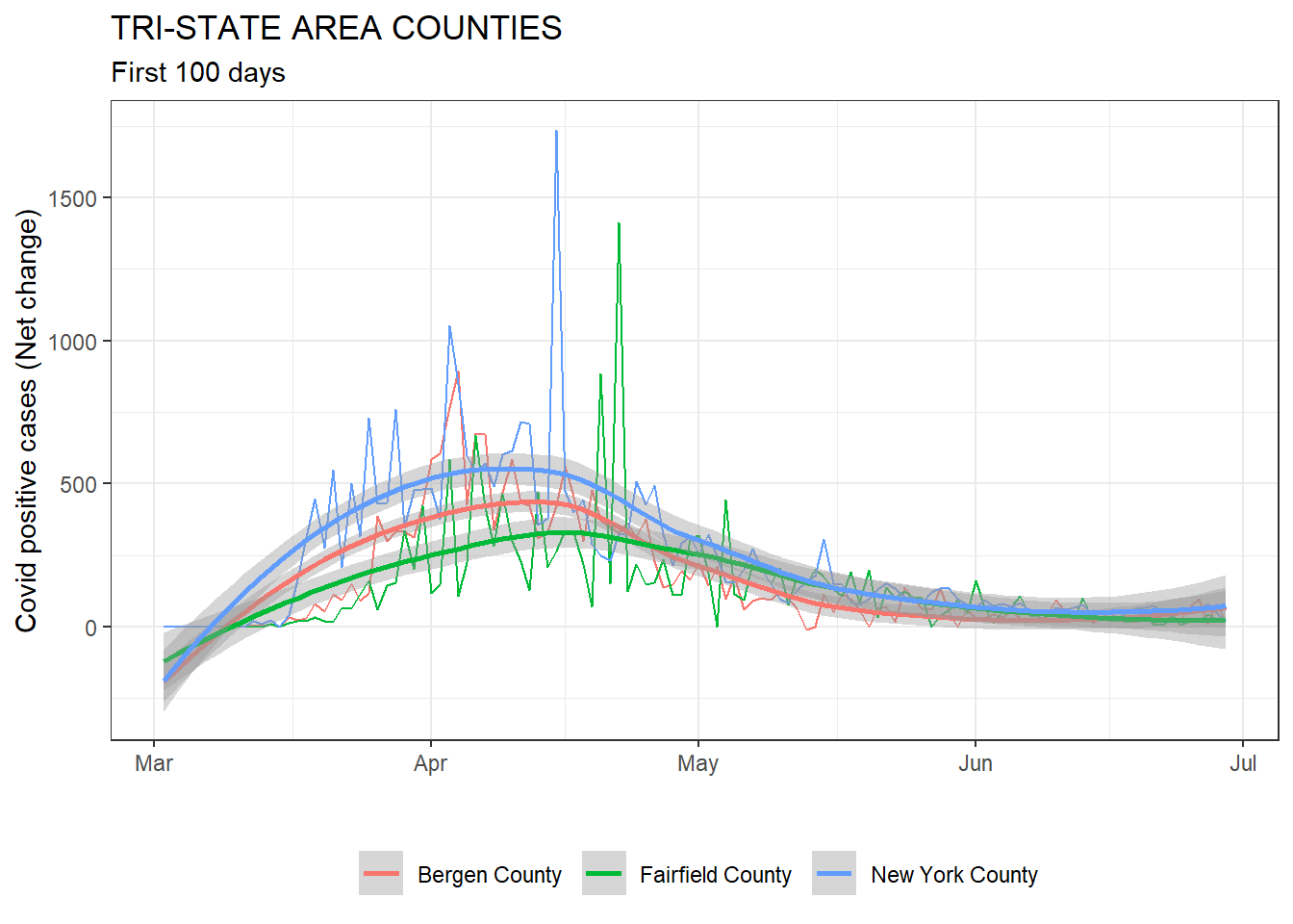
We filtered our daily Covid data only until the end of June last year, and we selected only one major county from each NY, NJ and CT.
We need to admit that choosing the first 100 days, and only three counties from a vast list of Tri-state counties are rather subjective decision. Other than 100 day being symbolic, we anecdotally remember the first outbreak and first wave of Covid spikes happened before the summer. In fact, the above time-series graph shows that the first peak of daily increase happened before May 2020. Plus, given its geographical proximity to New York City, Bergen and Fairfield counties are reasonable candidates for monitoring early Covid spread around neighboring regions.
Can you also see an early spike happened first in New York, then followed by Bergen and Fairfield counties? There were a few weeks of time-lag until Bergen and Fairfield numbers did catch up with New York’s.
Next question follows. What if we compare the entire county data in the Tri-state area, not just previously chosen three counties? By the way, to answer this question we need to remind ourselves that each county differs widely in size. So, to make a fair comparison, we will use Covid rates (in percentage) instead of case numbers.
Do you see the early Covid surge was mainly driven by big, large counties? Somehow, this finding reaffirms our previous observations that large states with big populations dominated the early Covid spikes before converging to each other in later stages. Again, we wanted to find out the reason why this happened, is it because of traffic? Or people in the densely populated area wanted to move around more actively despite Covid outbreaks? Let’s find out.
5.2 Mobility and Covid-19
Now, using the mobility data from the Trips by Distance data from the U.S. D.O.T Bureau of Transportation Statistics, let us investigate the mobility of people within the U.S. and find the impact that travel may have had on the transmission of COVID-19. In a similar fashion to the COVID-19 data, let us begin by looking at the macro and working our way to the micro.
First, let us aggregate the data to find the average Percentage of People Not Staying at Home (perNSAH) during the pandemic:
| County | State | avgNSAH |
|---|---|---|
| Covington County | MS | 0.9053043 |
| Leake County | MS | 0.8902768 |
| Washington County | AL | 0.8875680 |
| Cleburne County | AL | 0.8854244 |
| Appling County | GA | 0.8820754 |
| Worth County | GA | 0.8801277 |
| . | . | . |
| . | . | . |
| . | . | . |
| District of Columbia | DC | 0.6359379 |
| San Francisco County | CA | 0.6298997 |
| Kings County | NY | 0.6183068 |
| Bronx County | NY | 0.5988222 |
| Lexington city | VA | 0.5620147 |
| New York County | NY | 0.5138647 |
From this chart we can see a sample of the highest and lowest total averages of state’s mobility. This gives us a general idea of how the population of states traveled but, in order to produce significant results, we must investigate further the mobility of each state.
To do this, let us take an aggregated look at how each state has been moving considering the distance of trips within each state. The heatmap below gives us an overall picture of how each state was comparatively mobile by distance traveled in miles during the pandemic.
By this plot we can see that the overall percentage of trips by state were higher in states like CA, TX, and NY, and lower in VT, WY, ND. With this we can see North Carolinians took fewer 500+ mile trips than people from Colorado. To note here, the 500+ mile bracket is unintentionally fixed to the left hand side of the graph however, this could also could be considered the most important travel bracket since every state’s diameter (aside from one direction in CA and TX) is no further than 500miles thus, any 500+ mile trip means the travelers crossed state lines. This necessarily means possible transmission of the virus to other states.
Now, to get a better picture of mobility and compare this data against the concentrations of COVID-19, let us visualize the concentrations of infections and travel across the United States.
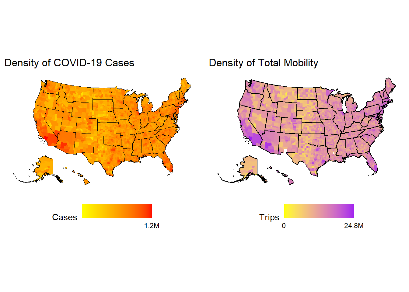
This plot allows us to see where in the United States people are the most mobile and allows us to compare those regions to where the highest concentrations of coronavirus are located. Unsurprisingly, most of the mobility occurs around highly populated, urban areas and subsequently, most of the COVID cases are also typically centered around the same areas. So, the findings so far point in the direction of increased mobility being linked to increased positive cases. However, to confirm this assumption we must investigate further into the cases and mobility of certain regions because, to say comparing Los Angeles County (with a population of 10.4million people) to any other random county in the U.S. is like comparing apples to oranges. Thus, to arrive at a poignant destination we must first find a couple of apples.
To do this, we will search for high and low mobility counties with similar stats (population, area, etc.) to compare and really be able to find and answer to the question of mobility affecting transmission. Accounting for density and population, the first matchup we have is: Pittsylvania County VA v.s. Walla Walla, WA.
| State | County | avgNSAH | Land_area | Pop_Density |
|---|---|---|---|---|
| VA | Pittsylvania County | 0.8616070 | 1,270 sq mi | 65/sq mi |
| WA | Walla Walla County | 0.6994145 | 1,299 sq mi | 46/sq mi |
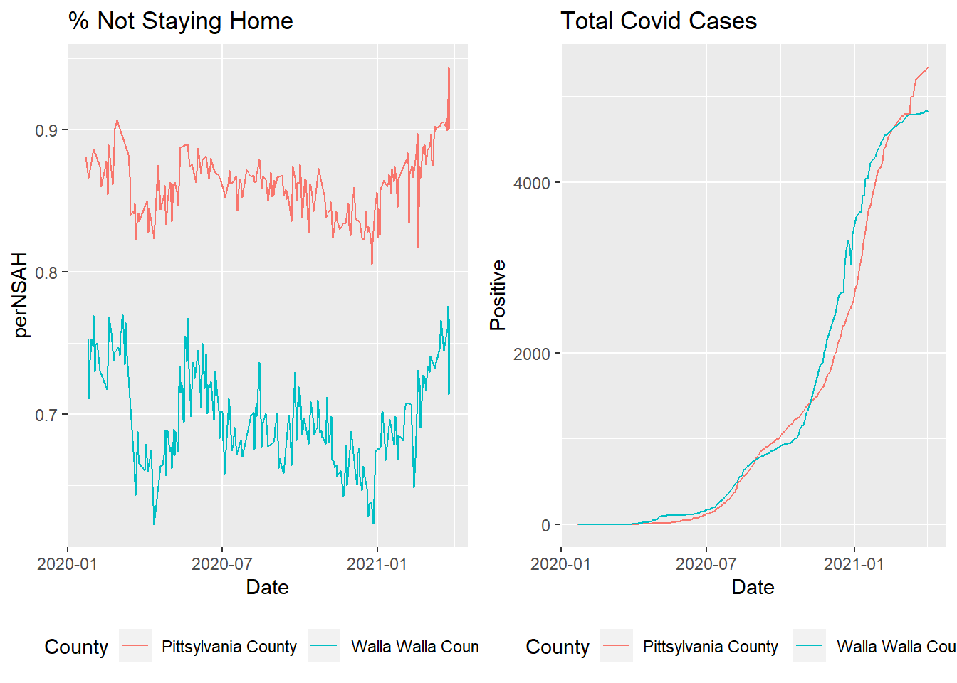
As we can see from this plot there were more people Not staying at home in Pittsylvania than Walla Walla, however, the total rates of covid remained similar. These counties are relatively small and not representative so, let’s look at another set to compare. Next up we have Brazoria County, TX v.s. Marin County,CA
| State | County | avgNSAH | Land_area | Pop_Density |
|---|---|---|---|---|
| CA | Marin County | 0.6836868 | 828 sq mi | 300/sq mi |
| TX | Brazoria County | 0.8179319 | 1,609 sq mi | 267/sq mi |
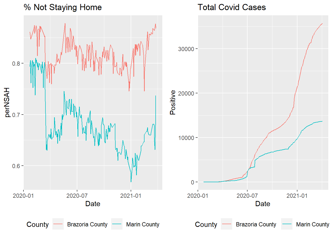
Here, more Brazorians went out than Marins and we can see a much higher rate of transmission in Texas. So, what does the comparison of these different counties tell us? That the results are mixed. There is no definitive proof that the stay at home orders worked. There are possibly other variables that affect transmission more than the mobility of society.
5.3 Air Travel and Covid-19
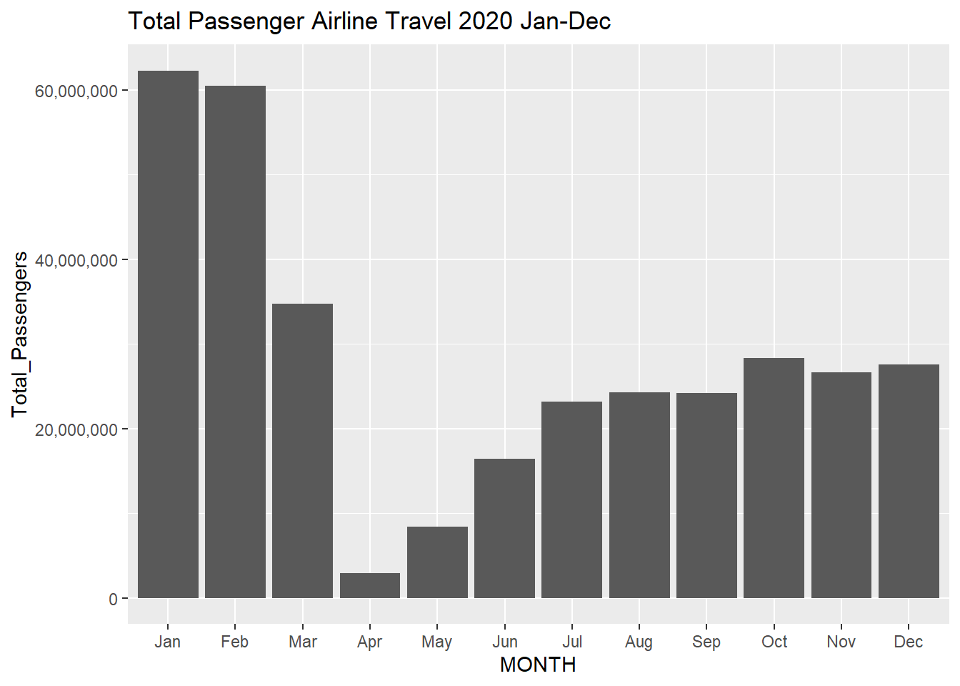
Continuing on the theme of mobility, while looking at Covid data through the air travel lens, the first obvious question is: what was air travel like in 2020 during this pandemic. The plot below aggregates the total number of passengers per month in 2020. It is clear that there is a significant drop in air travel across the United States at the beginning of the pandemic especially in the month of April. This makes sense as air travel in America was essentially grounded. It can be seen near the end of 2020 that air travel slowly started to pick back up, although not to previous levels before the pandemic.
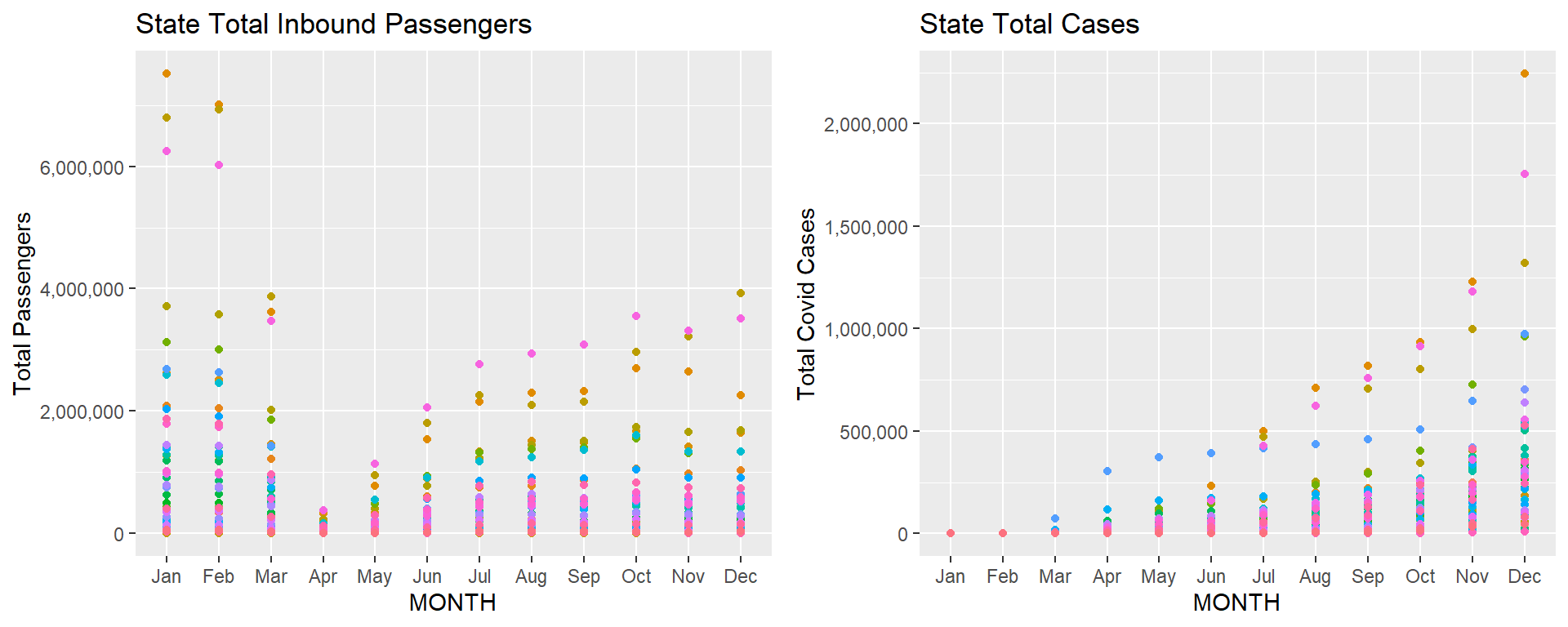
Delving a little further into this result, can we correlate air travel to states, to spikes in Covid? The plots below try to capture a potential correlation. The plot on the left shows per month, the total number of passengers traveling to a particular state, where each state is color-coded. The plot on the right shows the state cumulative Covid cases per month, where each state is color-coded. The comparison between the two plots is inconclusive however. For all states, the cumulative number of Covid cases increases per month exponentially adjusted by population. It is difficult to state whether this is directly correlated with air travel, because in April when flights are essentially at a standstill, all states having continued rising Covid cases. However, it can be seen that as air travel begins to pick back up in the later part of 2020, the cumulative Covid cases per state begins to rise more exponentially. Based on this airline data, it is difficult to correlate whether airline travel to specific states caused these specific Covid spikes in these regions, as it could be due to lack of data at the beginning of the pandemic, lack of testing, or even other policies such as social distancing and mask wearing.
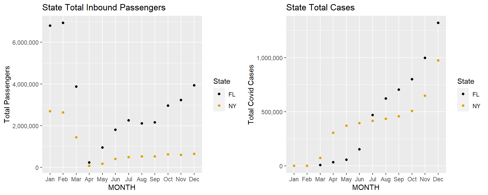
Taking a look at specific states might give us more information. Florida and New York are two states which have similar populations, and handled the pandemic in completely different ways. Florida had an open door policy and welcomed visitors from all states during the height of the pandemic, while the densely populated New York followed mask mandates and social distancing. Can we see this difference in policy visually?
The plots below isolate the two plots shown above for these two states. It is clear from the plot on the left, after the initial April shut down of flights, the total passenger travel to Florida as a destination significantly increased in comparison to flights to New York. This is due to people in the East Coast (New York, Chicago, Georgia etc.) escaping the winter for the hot beach weather in Florida. Taking a look at the cumulative Covid cases on the right plot, initially New York was significantly harder hit in the months of April to June in comparison to Florida. However, from July onward, Florida Covid cases spiked upwards and overtook New York. We can state that the continuous increase in traffic to Florida may have played a role in the increasing Covid cases, however, as discussed above, it could be just due to a lack of social distancing and mask wearing that led to this rise. Travel to New York was consistently down from April to December, and yet the cumulative cases continued to rise in the later months, to a similar number as Florida.
The only way to conclude the correlation between flight traffic and Covid spikes is with daily flight data. The data from the Bureau of Transportation Statistics aggregates flight data by month. If we had access to daily flight data for 2020, that would give us the ability to compare with daily Covid cases and see if increased air travel during a specific time (ex. spring break) accounted for a Covid spike in the following two weeks. However, this flight data is not accessible, maybe only through commercial resources, and the amount of flights daily in America, let alone in a year, would be a huge dataset that would be difficult to pre-process.